How to Read Trading Charts For Beginners
For anyone interested in trading, one of the first things you need to learn is how to read trading charts. Trading charts may seem like hieroglyphics to the uninitiated, but with a little study, they can be easy to read.
Just think that a chart is a visual representation of data. Like any other language, once you know the basic symbols and grammar, you can start to piece together meaning.
However, it can be a tough nut to crack. There are so many moving pieces, and it's hard to know what data is essential and what isn't. But don't worry, we're here to help. This article will discuss the most crucial data on a trading chart. We'll also give you tips on interpreting the data and making informed trading decisions!
What is a trading chart?
A trading chart visually represents a stock's price and how it has evolved. It often includes current and previous price movement information and is drawn on a grid. It may also consist of data like volume and financial information about the company.
As you shift your eyes left on the chart, the horizontal axis, or X-axis, displays the dates of price data further out from the current time. The vertical axis or Y-axis of the chart shows the stock's price level, which rises while looking upward and falls when looking downwards.
Technical indexes and price action overlays, such as a moving average (MA) of the price over a certain number of days, are sometimes included in a box below the price movement on a stock chart.
Types of Stock Charts
Bar charts, candlestick charts, point and figure charts, and market index charts are the four main types of trading charts. We'll go over each type in much more detail.
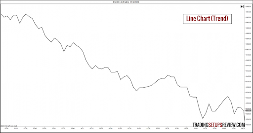
Line Charts
 ### Figure 1
This simple chart displays the price as a line with a single point at any time during the trading day, which is often the closing price. There are lines connecting each pricing point to the ones next to it.
The most basic stock chart type is a line chart. However, a trend line by itself does not reveal anything. Line charts and trend lines work well for displaying long-term trends but are less effective for a quick examination.
Bar Charts
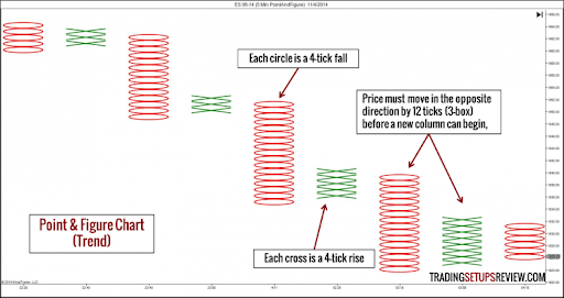
Figure 2
Opening, highs, lows, and closing prices are the four most important information displayed on a bar chart. The left-facing horizontal line reflects the day's opening price; the right-facing flat bar reflects the stock's closing price, and the vertical line shows the stock's daily range.
Bar charts are constructive for assessing trend reversals and tracking an asset's instability. If most vertical lines are long, the stock value may change dramatically over the day. On the other hand, small vertical lines indicate that the stock has been significantly constant.
Remember, more buyers are involved if the close is higher than the open, which may portend increased buying in the short term. Bar charts are generally best suited for short-term investors because they can show how much a company is likely to increase in value quickly and how unpredictable it is.
Candlestick Charts
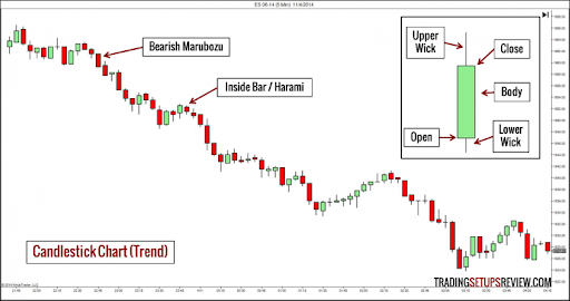
Figure 3
Candlestick charts, first used in Japan, are pretty similar to bar charts. However, candlestick charts contain even more data than bar charts.
Each candlestick's color shows whether the stock's price closed higher or lower for the day. The most common color palettes are white and black or green and red, with white or green representing up times and black or red representing down times.
Two wicks run from the top and bottom of the candle's body, representing the highest and lower levels of the stock's price range, respectively. The candle's "body" represents the stock price range from open to close.
There is more about the traditional Japanese way of reading candlestick charts, developed over many years of market observation. Do additional research on reading candlestick charts to improve your forecasting skills!
Point & Figure
Figure 4
Point and figure charts do not depict an asset's movement about a time axis, in contrast to the line, bar, and candlestick charts. P&F is used to plot the price changes of securities.
This chart is unique because it utilizes Xs and Os to depict price changes. Each X and O denotes a price change. When the price changes by a predetermined amount, an X is indicated, and an O is shown, respectively.
The "box size" is the predetermined quantity, depending on the stock and the individual investor's preferences.
P & F charts are helpful because they provide information on price changes while eliminating all the noise and fluctuation that results from measuring over short periods. Investors prefer P&F charts because they claim to make it easier to spot actual trends and breakouts and to make investors less sensitive to modest price fluctuations.
Checking the Trend Lines
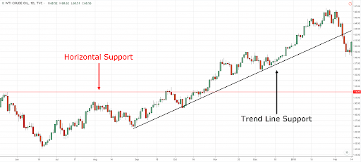
Image Credit: Rayner Teo
If a price trend is present for a particular stock, it can be determined by reading trend lines. Price trends are directional movements in which the highs and lows of a stock's price are elevated.
Technical analysts can quickly determine whether and to what extent a trend is present by visually drawing trend lines between those highs and lows. A lot of analysts also construct trend lines and use trend indicators like the 200-, 50-, or 20-period MA.
Understanding Stock Splits
A stock split typically takes place when its price has grown sufficiently for average investors to no longer be able to purchase it in round lots of 100 shares. As a result, the stock split expands the pool of potential buyers and generally increases demand, frequently boosting the stock price after the split.
For instance, if a $100 stock splits 2 for 1, the stock would open the following day at $50 per share, giving existing stockholders twice as much equity as they did before the split.
A reverse stock split is the total opposite of a stock split. For instance, a reverse 10-to-1 stock split occurs on a stock with a $1 per share market price. The stockholder would later own one share at $10 per share for every ten shares they already owned.
On the day the split takes place, a stock's price chart is often updated to reflect stock splits and reverse stock splits. When interpreting stock charts created by reputable charting services or trading platforms, splits do not need to be considered.
Looking at Trade Volumes
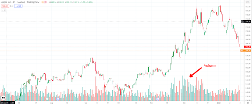
Image Credit: PublicFinanceInternational.org
The stock's trading volume data typically reflects the level of market interest in the stock. Significant trading volume changes may signal that the stock is moving in a particular direction.
Keep a close eye on volume numbers since shifts in the stock volume can indicate breakouts from the traditional continuation and reversal patterns. Technical analysts observe this in a stock's price since it can be predictive.
For instance, if a company's price rises significantly, the stock will likely continue to rise, supporting the upward trend. The same principle usually applies if a stock decreases in many volumes. Volume tends to increase gradually when stops are reached while stocks are falling, which can exacerbate the loss and potentially lead to a crash.
Takeaway
When it comes to trading, there is a lot more to understand. The above points are merely the fundamentals of what you should focus on when reading trading charts. For various technical purposes, there are many different stock chart types out there. You should conduct some research because you need to understand how to read a stock chart to perform any technical analysis.
If you're planning to trade American stocks try exchanging your currency first with RemitBee! We offer the best CAD to USD rates and its completely online!